
S&P 500, Nasdaq 100
The thrill of new highs in NVIDIA and Apple and their positive effect on the S&P 500 and Nasdaq 100 are undercut by underlying breadth indicators.
The situation is this: the heavy weighting of those 2 stocks (and a handful of others) is bending sentiment toward highly bullish but other components of those indexes are not having as much fun.
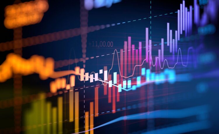
The 7 Stock Market Charts.
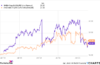
The S&P 500 daily price chart looks like this:
S&P 500 daily price chart, 6 13 204.
This week’s new high is red-circled. The index continues to trade above both the 50-day and the 200-day moving averages. What a rally from October 2023 to the present.
Okay, fine, but here’s the daily chart of the S&P 500’s “new highs/new lows per cent” which shows a different story:
S&P 500 New Highs-New Lows Percent, 6 13 24.
The percent of S&P 500 stocks making new highs versus those making new lows failed to make a new high when this week’s S&P 500 got there.
Here is the percent of S&P 500 stocks now showing “bullish point-and-figure” patterns:
$BPSPX 6 13 24.
This breadth indicator is another one failing to make a new high here as the S&P 500 is. The negative divergence is similar to the new highs/new lows percent chart, confirming the basic issue with a different methodology.
Now, here’s the Nasdaq 100 daily price chart:
Nasdaq 100 daily price chart, 6 13 24.
This week’s new high is in the red circle. Note that the index trades steadily above both its up trending 50-day and 200-day moving averages.
Here is the daily chart for the Nasdaq 100 “new highs new lows per cent:”
Nasdaq 100 New Highs-New Lows percent, 6 13 24.
The big blast upward of component Apple helped to take this breadth indicator to a higher level than mid-May — but it remains lower than the January, February and March highs. It’s another negative divergence showing how fewer stocks are participating.
The Nasdaq 100 bullish percent index is here:
Nasdaq 100 Bullish Percent Index, 6 13 24.
The percent of stocks in the Nasdaq 100 now in bullish point-and-figure patterns is lower than the mid-May high and much lower than the late December 2023 high. As the Nasdaq 100 trades higher, fewer and fewer components are joining. The heavy weighting of a few big cap tech and social media names is an issue.
One more, here’s the daily price chart for the iShares Russell 2000 ETF:
iShares Russell 2000 ETF daily price chart, 6 13 24.
The small caps refuse to make a new high along with the S&P 500 and the Nasdaq 100. This week, they failed to rise above the May high and failed to rise above the late March high. It’s another negative divergence.
How long can the outstanding performance of Apple, NVIDIA and a few others keep going when the rest of the market is resisting? You got me.


