

Stay informed with free updates
Simply sign up to the Workplace pensions myFT Digest — delivered directly to your inbox.
It’s Purple Book Day for all who celebrate — the day when the Pension Protection Fund casts light upon the asset allocation machinations of UK private sector defined benefit pension schemes.
Fine, OK, this may not be everyone’s cup of tea. But we like to poke around to see if anything interesting has been going on in one of the largest pools of institutional capital in the world, even if their assets are much-diminished following the 2022 bond rout.
The news is largely as you’d expect, but we’ve jazzed the numbers up into pretty interactive dataviz. And we’ve found some cool data on the demography of the system.
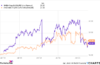
For the 18th consecutive year, UK pension schemes have been selling UK equities:

Assets are overwhelmingly held in bonds, cash, as well as a little bit of miscellaneous. And UK stocks are now just 0.7 per cent of pension assets — a mere tenth of their allocation to private equity. Which is a shame given the storming time UK stocks have had this year, outperforming global stocks by over 6.6 per cent.
Overall, the system is in massive surplus, meaning that the British companies that sponsor these schemes won’t be hit with humungous cash calls to make good their deficits, as per yesteryear. And this is a good thing:

And it was another monster year for risk transfers — deals where companies offload both their pension assets and their pension liabilities over to insurance companies. For the second year running these totalled almost £50bn (excluding longevity swaps, where the pension fund just offloads some of the risk that their pensioners don’t die at a time specified in their actuary’s spreadsheet):

We’re always interested in the demography of the PPF universe — how many schemes there are, and how much each of these schemes is managing. But this demography doesn’t change a huge amount from year to year.
Rather than show you how much change hasn’t happened, we spotted a more granular-than-usually-published chart that breaks down the PPF universe and asked the PPF to provide the underlying data. To Alphaville’s delight, they obliged.
And this allowed us to look at the burning question as to how much of UK defined benefit private pension assets are controlled by the very largest funds. The answer is quite a lot:

We’ve packed quite a lot of information into this last chart. It shows the cumulative share of assets controlled by the cumulative share of pension schemes. That you need to go a very long way to the right before it starts kicking up indicates that the vast majority of schemes are small.
How small is small? If you hover your pointer over the line and jiggle it around until a pop-up box appears, you’ll see that 90 per cent of schemes have £300mn assets or fewer.
The PPF provided data bucketed by asset size. And we’ve sized the dots on the line by the average size of assets for funds in each of these asset size buckets. We’ve also shaded them according to how many schemes are in each bucket.
It gets a bit fiddly with these smaller asset size buckets, but if you’re still hovering your pointer over the right dot above the 90 per cent mark, you’ll see also that there are 71 schemes in the bucket, with average assets of £272mn.
We thought it was interesting that around half of total system assets are controlled by one per cent of the 4,838 pension schemes in the PPF universe. And a quarter of system assets sit in just 13 funds.
But before we get carried away thinking that some pensioners are fabulously well provided for, we should note that we’re looking at pension schemes rather than pension members. The largest dot on the chart is the £75bn University Superannuation Scheme. They have over 554 thousand members — just over six per cent of UK system-wide private sector defined benefit scheme members.
We’re not sure what to do with this more granular understanding as to the distribution of assets by scheme. But we thought we’d share it anyway.


